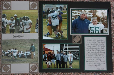
This is for Randy's book I used Sportsmania and Pooh font. It is what I am calling a 3-page layout. It's 2 full 12x12 pages and then a 6X12 in between the 2, the 6x12 is already in a page protector. I think that's going to be a fun way to fit in a few more pages. I also used my gypsy. It's starting to get where I can't scrap without it, it's just so quick! I do still like to look through the handbooks though, so much better than just looking on the screen.

 I'm not really sure why I took these pictures, let alone printed them, but I decided just to scrap them, this is for the family book. I used Home Decor for the bird, and of course the gypsy.
And last but not least, another unhappy Tuesday weigh in. I was up .2 this week, which isn't really a big deal, but, I'm starting to get frustrated less than 4 pounds from goal. I'm not really sure what the cause is as I haven't really been doing anything differently, I will keep chugging along, though!
Thanks for looking!


3 comments:
Great layouts. And I love your bird pictures.
I love the idea of the extra 6x12. I've thought about that for my p365. I has to find out where to get the page protectors. The pages look great!
I love the bird ones, the other is great also.
Post a Comment